adrift font
following hot on the recent cell width tunings for the serifless capital I and lower case l, comes the adrift font with cell width adjustments for the lower case hooked glyphs..

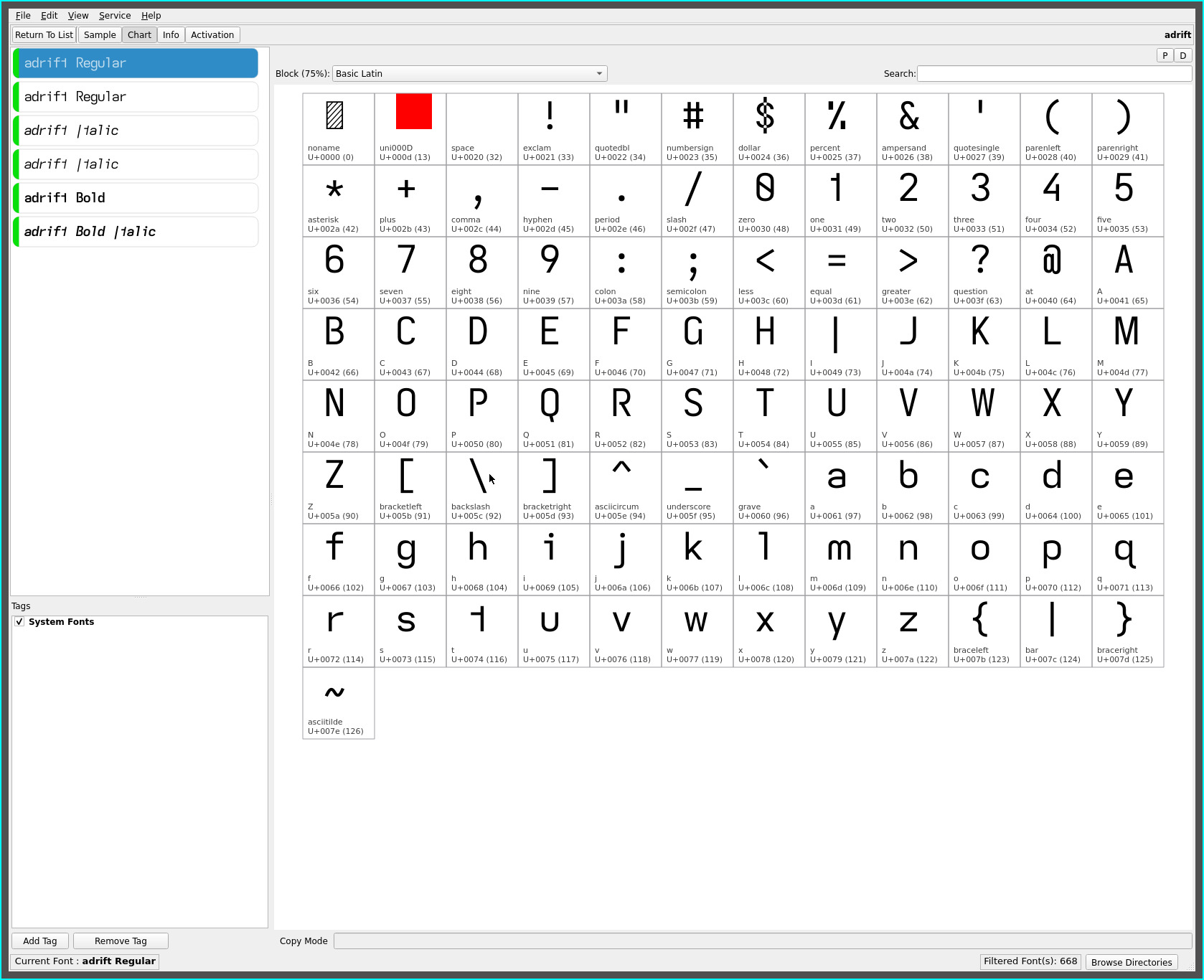
adrift is essentially the drift font with the descending capital I unique to the typefaces produced on this site—its name at six characters to differentiate it from the regular I cap height of the other fonts in my rotation.
The descending capital I adds an anchor point to the font and makes the letter stand out even more, especially in first person narratives. In headings it takes some getting used to—but each to their own.
More importantly..
cell widths
as an advocate of monospaced fonts for the uniform visual cadence they provide for reading, glyph set combinations have largely settled down in this exploration of high readability fonts using non-mirrored asymmetric glyph shapes.
This culminated in the base set of fonts drift, draft, stria and patio. With glyph sets combinations having possibly come to an end(!), attention has returned to the visual density of these (largely) monospaced fonts.
With the subtle refinement offered by the extended width upper and lower case M W and the narrowed width of serifless capital I and serifless lower case l, serifless and hooked glyph spacing for combinations of the lower case i and l began to stand out more. Thus, the following cell width adjustment for the above fonts..
| font | 0.85x | 0.925x (new) | 1.25x |
|---|---|---|---|
| adrift | descending capital I | hooked i j l | M m W w |
| adrift** | hooked i j l | M m W w | |
| drift | serifless capital I | hooked i j l | M m W w |
| draft | serifless l | hooked i j | M m W w |
| stria | serifless capital I | hooked i j tailed l | M m W w |
| patio | serifless l | hooked i j | M m W w |
**See adrift below
These subtle cell width adjustments render a more uniform visual density while maintaining the overall visual cadence afforded monospaced fonts (perhaps marking the conclusion of this font journey! :)
The proportions are derived purely from visual experimentation at the very small font sizes i happen to read at. Future eye sight requirements for reading at larger font sizes may necessitate revisiting the values applied.

repos
These cell width adjusted fonts may be found on OneDrive.
The previous font sets have been moved to the “archive” folder.
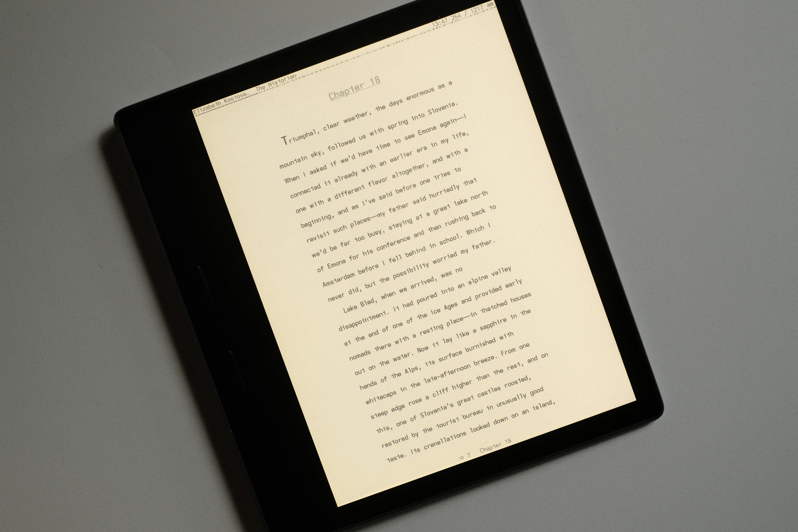
Kindle specific fonts with wider line spacing adjustments (to accommodate Kindle’s limited layout control) are no longer generated—finally jail broke my Oasis and installed KOReader. These fonts may still be used on Kindles, just limited to the devices’ line spacing options.
adrift
is offered in the repos with the more common serifed capital I as well (rather than differentiating this glyph set from the descending capital I variant with yet another font name—the rationale being that preferences will be for one glyph set or the other and, most likely, the more familial serifed flavour).

In a way, from a nomenclature perspective, adrift derives itself more directly from the drift and draft fonts, adding the serifed capital I from draft to drift :)